NASA Data Exchange (DEx)

Saving SLS engineers fifteen days per review
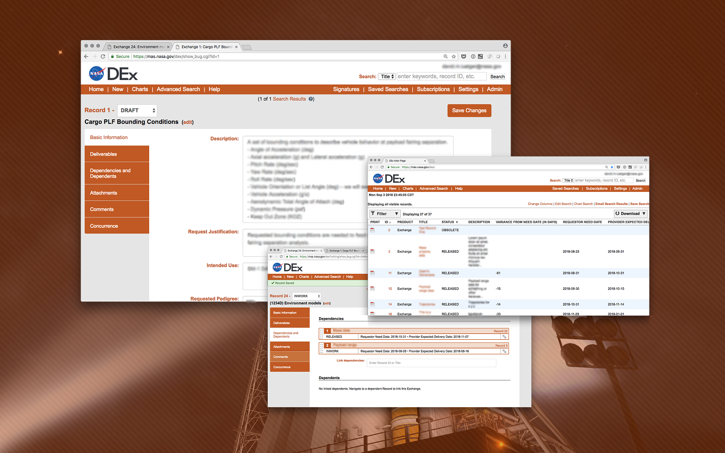
A collage of screenshots from SLS DEx.

I led the research, information architecture, and design on DEx, a web application to support NASA SLS engineers' data exchange process. It halved the time required for reviews and reduced stress throughout the organization.

Project details

Partner

NASA Space Launch System Program

My role

UX Research + Design Lead

My contribution

  • UX research
  • UX strategy
  • Interface design

Impact

  • Fifteen days saved per review
  • Five days saved for signature process

SLS engineers were struggling to exchange designs and drawings with each other.

Perhaps the most visible part of Artemis I was the Space Launch System (SLS). Engineers and contractors had to collaborate on, exchange, and review all sorts of environment models, trajectories, drawings, schematics, tables, and more so that it could become a reality.

To keep track of everything, the folks at SLS had come up with a process for requests, signatures, and deliveries. However, it was run by a single person inside an Excel spreadsheet of ever-increasing size and complexity. Nothing was working as expected. There were many bureaucratic silos and unclear requests. Things weren’t getting delivered on time (if at all), and it took way to long to get everyone to sign off on things. While there was a process in theory, it wasn’t really being followed, creating stress and unhappiness throughout the organization.
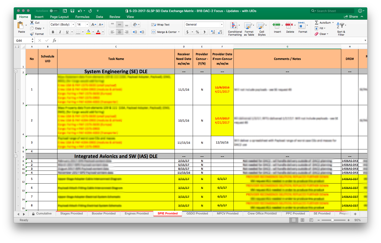
I led the user research and product design on a web application made it easier to share and sign off on data.

I led an end-to-end research and design cycle on this project, including:
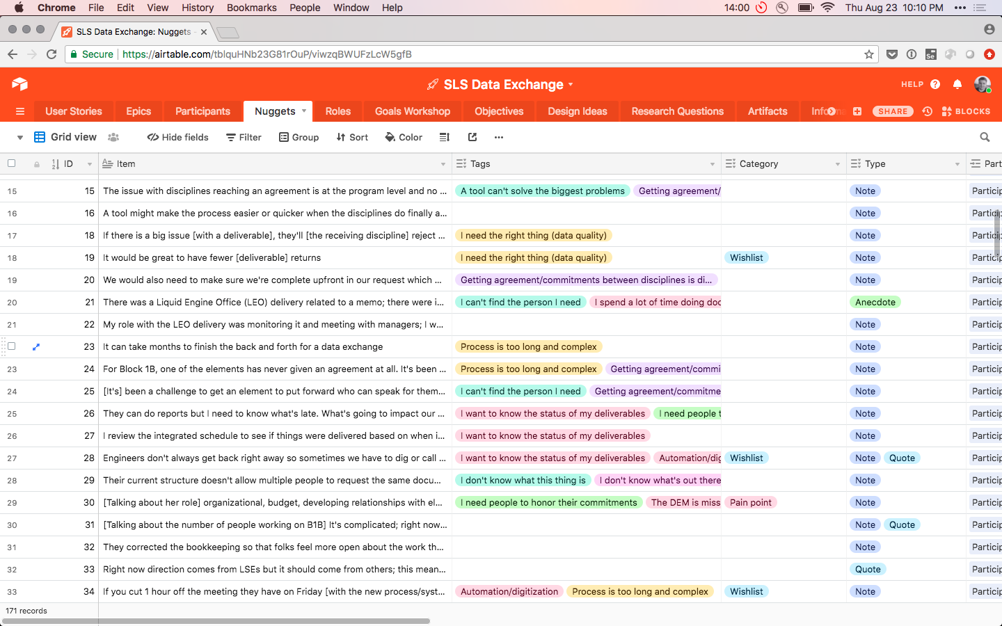
  • In-depth interviews with participants from four key user groups
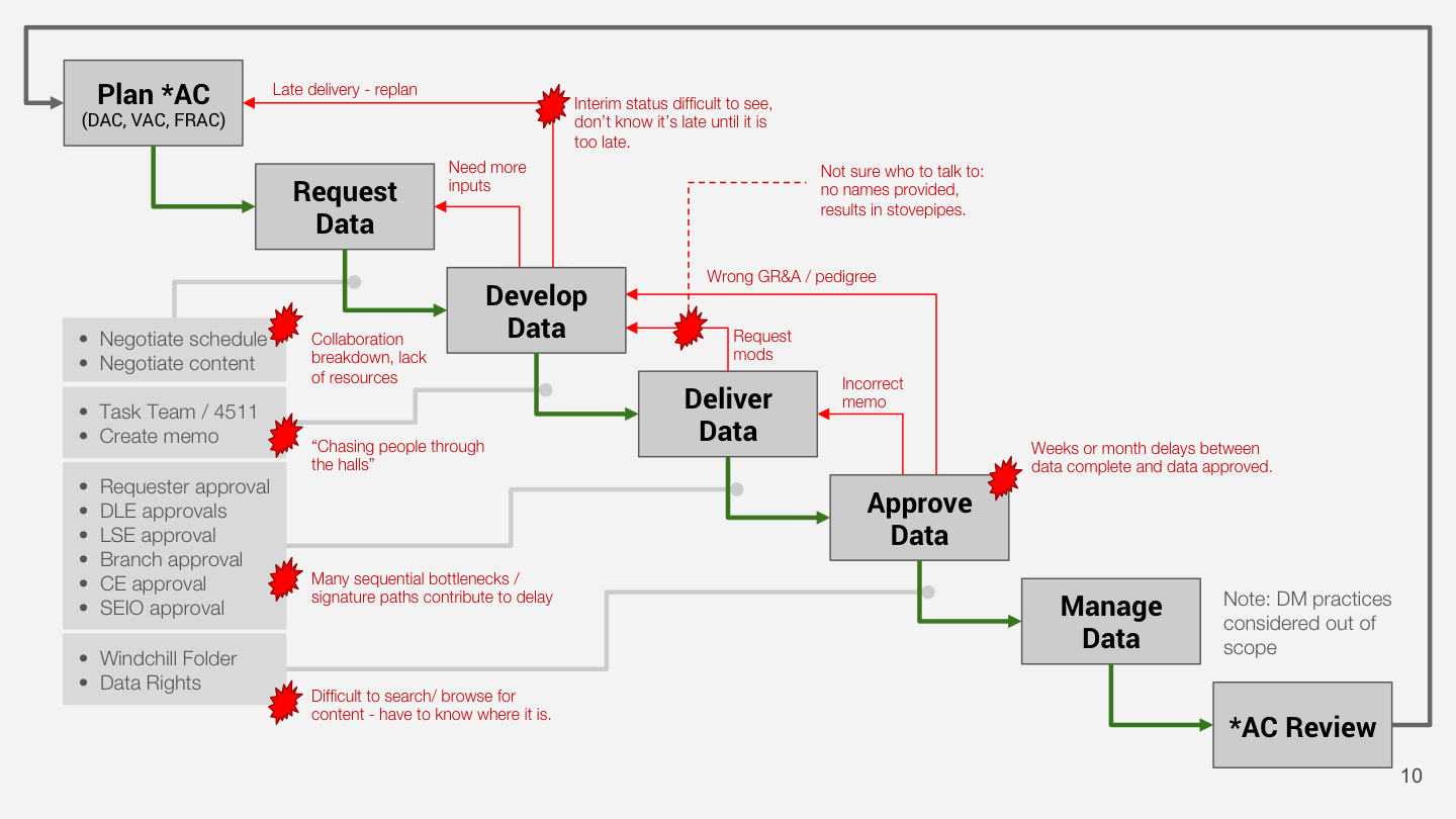
  • Modeling the data delivery process and identifying the main breakdowns and opportunity areas
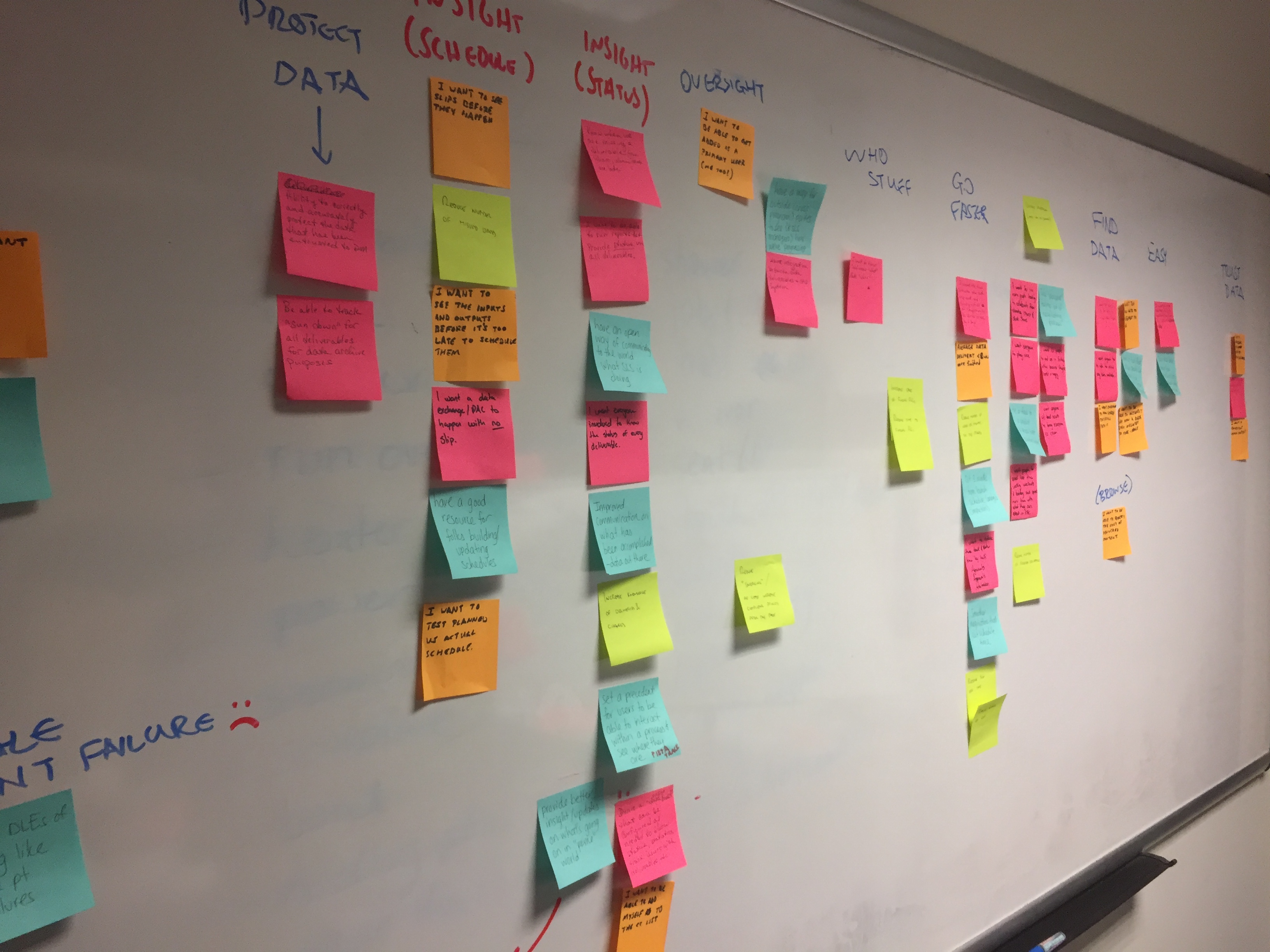
  • Creating a detailed research repository to “quantify” our qualitative data and ensure we could have a strong link between our evidence and decisions
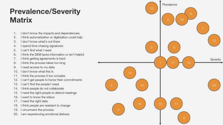
  • Analyzing the opportunities based on their prevelance and severity, and determining what was most important to go after first
  • Designing an information architecture using a combination of our user research and process artifacts like memos and the existing Excel spreadsheet
  • Identifying the core features and writing user stories to address the most important opportunities
  • Usability testing to validate our designs and product direction
  • Coaching our partners through the user-centered design process, and inviting them to observe interviews and participate in workshops and synthesis

We introduced evidence-backed features that saved engineers time and gave them peace of mind.

Our research revealed a few key opportunity areas we could see were most important, so we focused on solving those first. We introduced the following:

  • Search / centralized database: This got engineers away from scattered inbox attachments and gave them a way to find what they were looking for as soon as it was in the system.
  • Points of contact: Every record in the system has an assigned set of users with a real account. They can be contacted directly without having to hunt and peck for an email address or phone number.
  • Linked records: This clearly identifies dependencies and dependents for any record, making it easier to determine everything that may be affected if a change is made to one item.
  • Comments: Previously, any dialog about drawings and schematics was scattered across various email chains. The comments feature lets the conversation take place in one transparent place so everyone is kept in the loop.
  • Digital signatures: It used to be that every data exchange required someone to physically sign a piece of paper in ink. We introduced validated, digital signatures to facilitate a much faster approval process.